What's New in Salient Mobile
Salient Management Company is dedicated to helping our clients improve their performance and efficiency through better and faster access to actionable intelligence. We continuously strive to improve our revolutionary suite of solutions. To take advantage of recent enhancements in the Salient mobile app, we recommend installing the latest version of the Salient Dashboards application.
Version 1.11
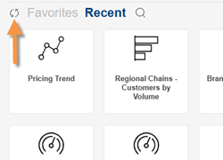
Refresh dashboards
A new icon lets you synchronize dashboards with the Salient Dashboards browser application at any time without logging out of the mobile app.
Support for enhancements in Salient Dashboards V8.7
This version provides support for the following enhancements in dashboards.
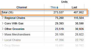
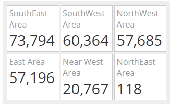
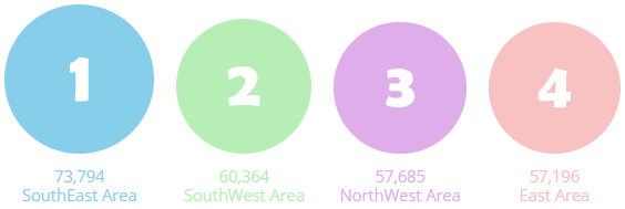
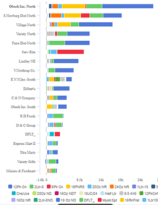
Totals at the top of grids*
This new option shows summary data at the top.
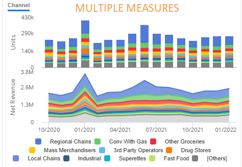
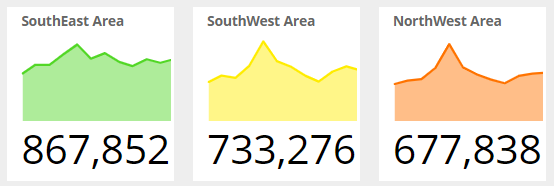
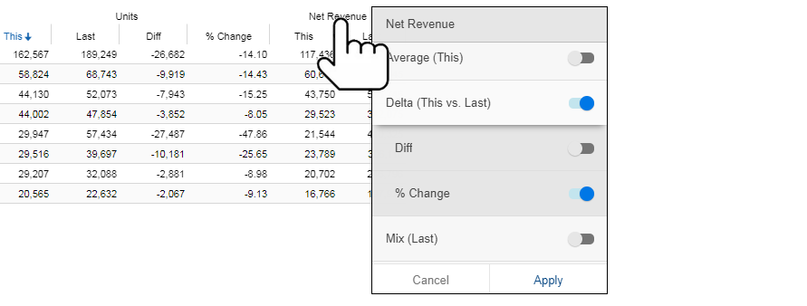
Share Trend improvements
|
|
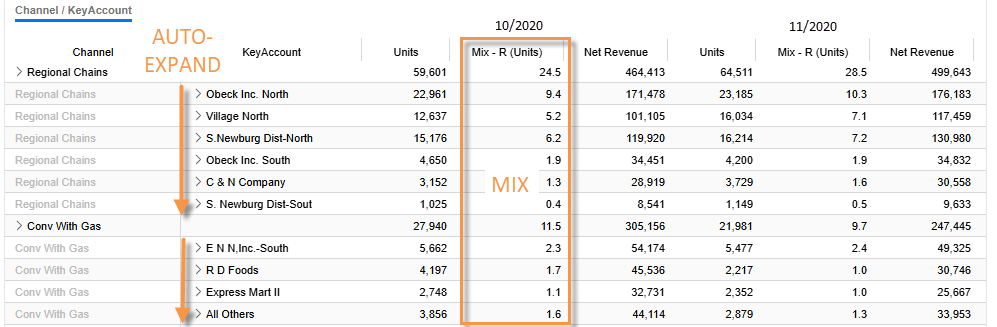
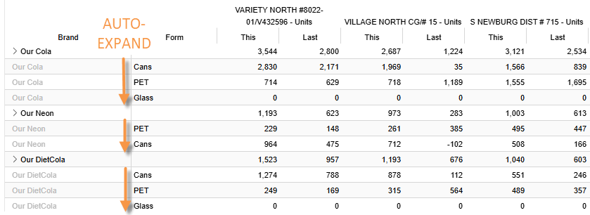
Fully-granular data in Crosstab analyses
- Auto-expand data to additional levels of detail
- View key-level data (e.g., by customer or product)
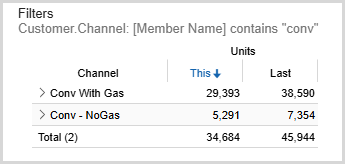
Dynamic filter enhancements
|
|
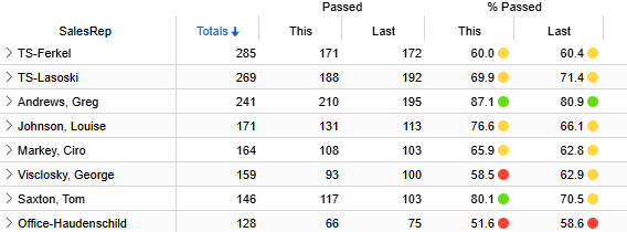
Highlighting in test-based analyses (exception)*
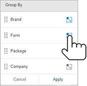
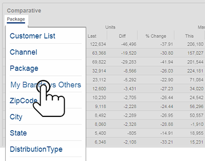
Custom groups of key level data*
Compare custom groups of customers, products, and other key entities. This feature was previously only available at the dimension level.
Custom comparisons for incomplete timeframes*
Weighted day tables can provide custom comparisons of an incomplete month or period versus a year ago. This feature adjusts the data for the previous date range based on a percentage of the current timeframe that is expected to have occurred by a given date.
* Must be pre-built into the dashboard.
Version 1.10.2
Improved sharing
This version improves sharing of dashboards across more types of applications (e.g., email, text messages, Microsoft Teams, etc.). The shared content includes a screenshot and dashboard link.
Exception (test-based) enhancements
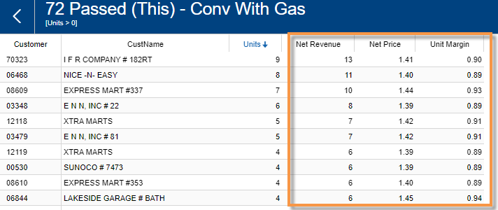
You can tap anywhere on a bar in an exception widget to access pass or fail lists (e.g., buyers or non-buyers).
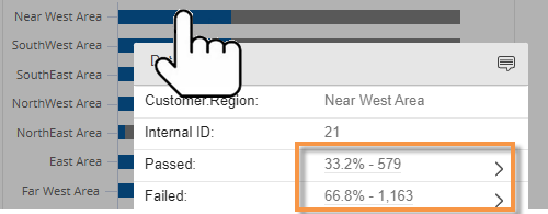
You can add measures to exception widgets within the mobile app. The measures will appear in lists to provide more information about what passed or failed.
Version 1.10.1
The mobile app can display scannable bar codes if they have been configured and built into dashboards.
Version 1.10.0
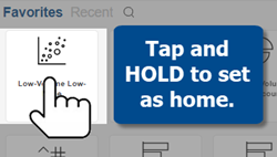
Custom home screen
You can customize the home screen that appears when you open the Salient Mobile app (requires Salient Dashboards V8.6). Options include:
-
A custom landing dashboard (i.e., portal) designed by your organization
-
Your own personal home dashboard
-
The default home screen from previous versions
To choose the home screen, make your selection in preferences of the Salient Dashboards browser application.
Home dashboard selection
|
You can choose the home dashboard from within the Salient mobile app (requires Salient Dashboards V8.6). This home dashboard is shared with the Salient Dashboards browser application for a consistent view across devices.
|
 |
Support for Salient Dashboards enhancements
This version supports several new capabilities in Salient Dashboards Version 8.6 and 8.6.1.
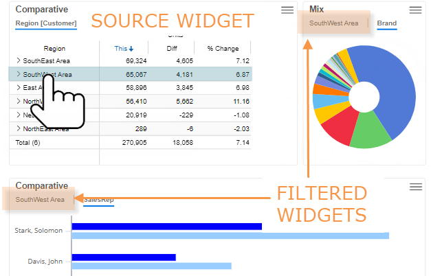
Widget filtering
If widgets are linked, you can select a row or graph component in a "source" widget to filter other widgets in the dashboard. This filtering capability must be built into the dashboard.
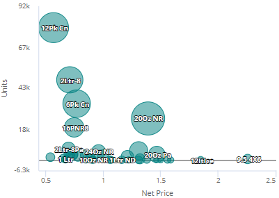
Bubble charts
The bubble chart is a new type of scattergram that can display three or more variables in an engaging visualization of correlations and outliers.
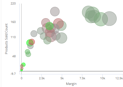
Color scatter plots
Scattergram plots can use color to represent an additional metric, such as percent change since another timeframe.
Difference (delta) in passing/failing numbers
Exception widgets can include difference and percent change in how many members pass or fail test criteria. For example, how many more or fewer customers bought each brand this month versus last month?
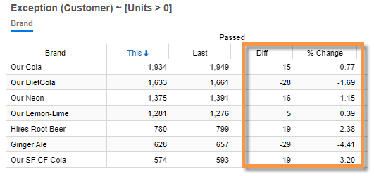
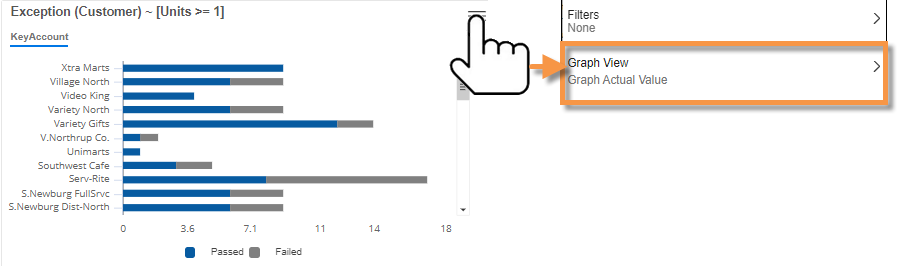
Chart how many passed and failed (actual numbers)
In an Exception graph, you can chart the actual counts of how many passed and failed the test. This new view lets you visually compare the total number of members (e.g., customers) in each grouping as well as the number that passed and failed.
Other enhancements
In addition to the features shown above, the Salient mobile app supports the following V8.6 capabilities. See the Salient Dashboards help for more information:
- Cross-date scatter plots
- Custom colors, icons, and sizes in Scattergrams
- Scattergram reference lines to create quadrants
- Simplified gauges
- Date details in column headers
- Workspace filter groups
Version 1.9.36
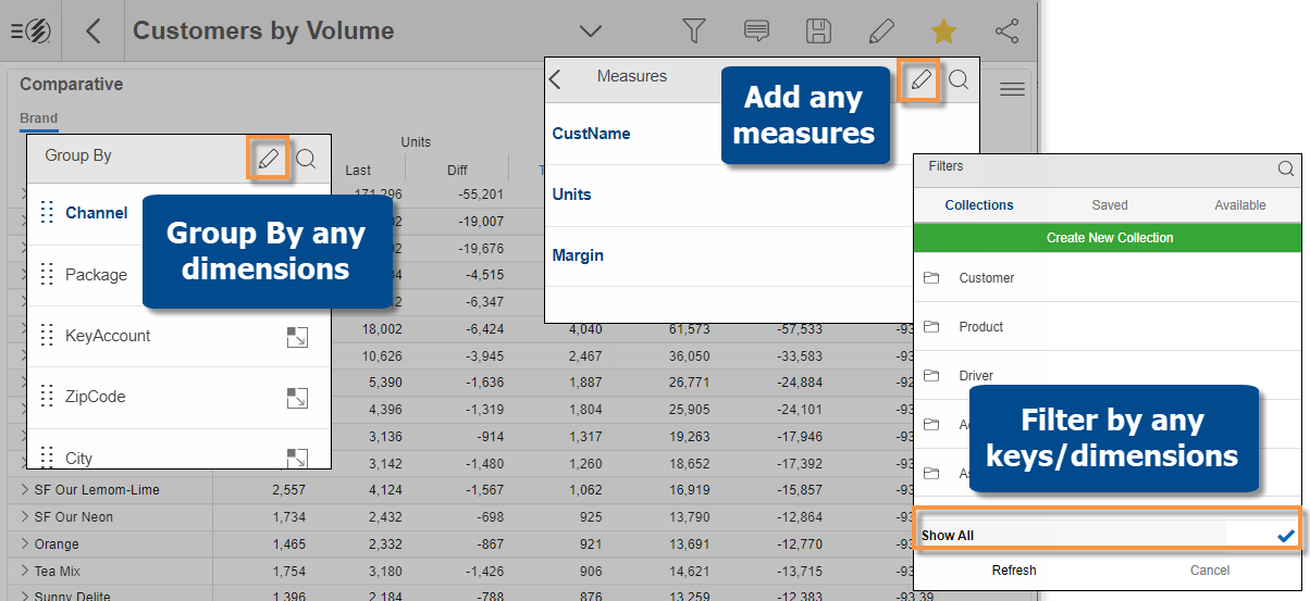
More access to data for Power Viewers
View mode provides access to more data—beyond what was built into the dashboard. Power Viewers can add any measures, group data by any dimensions, or filter on any subset of the data (via collections) without switching to explore mode. This enhancement includes the ability to access data in other cubes (i.e. activities or data sources). These new options are available in all new and existing dashboards by default, but they can be turned off by the Dashboard Designer.
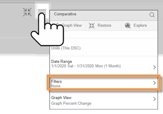
Add and edit widget filters
|
This version provides better control over filters for individual widgets. In a widget, tap on You can then apply or create a collection to filter on any subset of the data. You can also edit, clear, or remove widget filters in this area.
|
|
Column filters
You can filter individual columns in Multi Comparative widgets to compare any subsets of the data. For example, compare various types of products within the same widget.
|
Just tap the column heading; then add a collection-based filter to narrow down on whatever you are interested in. You can also edit and/or remove column filters. Columns may use other types of filters, including dynamic (i.e., test based) filters and benchmarks such as "all others" and custom cohorts (NEW in Salient Dashboards V8.4), if they are built into the dashboard.
|
|
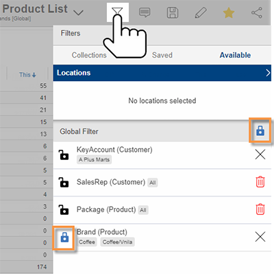
Dynamic filters
This version supports test-based filters (NEW in Salient Dashboards V8.4) to dynamically isolate and analyze parts of the business. Example uses include active customers (bought something this period), new customers (bought something this period but not last), high or low margin products, and much more. In the Salient Dashboards browser application, users can set up custom rules and apply the dynamic filters to widgets and/or columns. You can then view dynamically-updated results in the mobile app.
More options for sharing
|
A new option copies a dashboard link that you can paste into an email, text, or other application. Previous sharing options are still available. |
|
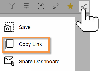
Cross-platform dashboard links
On mobile devices, standard dashboard links (i.e., http:// or https:// prefix) take you to a landing page where you can choose whether to open a dashboard in the mobile app or a web browser. You can also choose your preferred method to bypass the landing page the next time you open a link. This new option requires Salient Dashboards V8.4+. Mobile dashboard links (i.e., salient:// prefix) open directly in the mobile app like previous versions.
Version 1.9.27
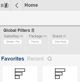
You can turn global filters on individually for better control over the data you are viewing. For example, you might want to stay focused on a particular brand as you view different dashboards. Previously, global filters were turned on as a set.
|
Tap the To turn all dashboard filters on globally, tap the |
|
 icon to beside a filter to turn it on globally (i.e., lock on
  ).
).Version 1.9.26
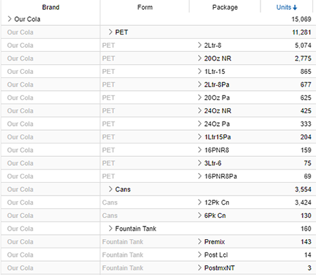
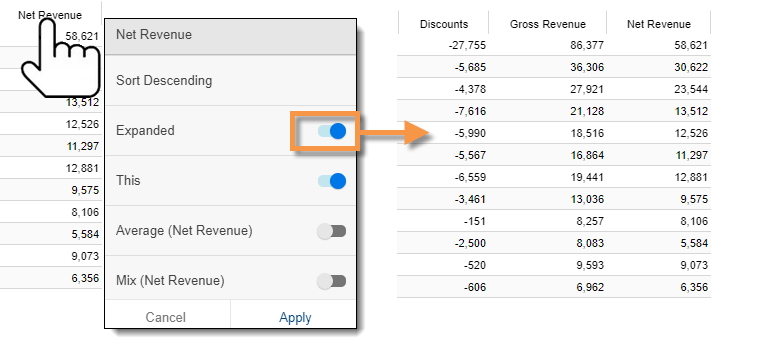
This version provides better, faster access to multi-dimensional data to identify specific opportunities for improvement.
Faster row expansion
You can automatically expand dimensions and keys to see underlying data.
|
Just turn on auto-expand for a dimension or key; all its members will be expanded to the next level. You can expand multiple levels to create a detailed grid of performance metrics.
|
 |
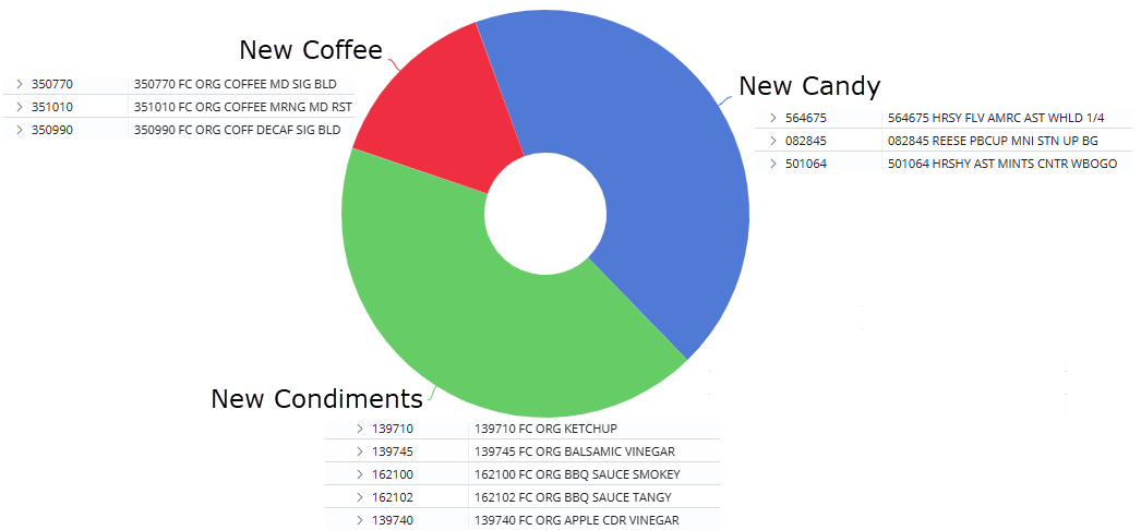
Multi-dimensional visualizations
You can expand dimensions and keys in some graphs to visualize performance at a more granular level. The data may be grouped under the parent level or sorted independently.
|
For example: In a mix graph, see how each piece is broken down into its components in a "sunburst" chart. |
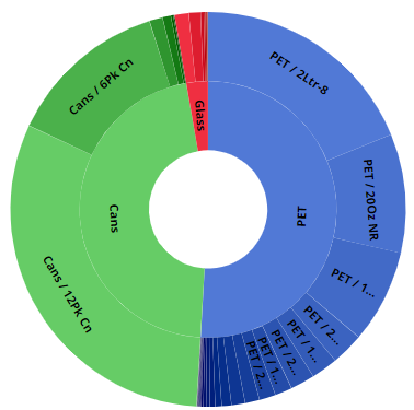 |
|
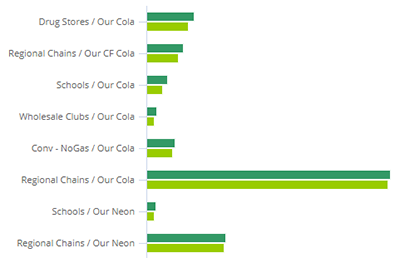
In a comparative graph, view performance for channel/brand combinations. |
|
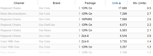
New multi-dimensional grid
A new multi-dimensional grid organizes subgroupings independently of their parent level. This new "flat" view removes the constraint of a dimensional hierarchy. You can sort the rows to find opportunities and drill down to investigate any cross-sections of data. A flat view can be built into a dashboard or selected in explore mode.
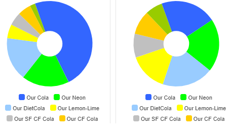
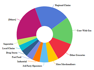
Key-level pie charts
The mix chart is now available at the key level (e.g., by customer or product) to show how much individual key members contributed to the total.
Version 1.9.24
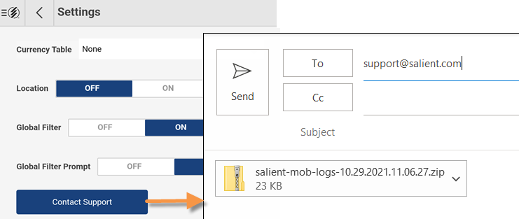
You can email information to Salient support to assist with troubleshooting. This new feature is available in the login screen and the settings area. Just tap to create an email with log files attached.
Version 1.9.23
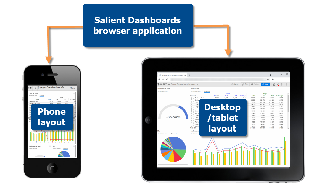
Improved design process
This version streamlines the process of designing a dashboard. Within the Salient Dashboards browser application, Dashboard Designers can set up a phone layout and desktop/tablet layout—each with its own arrangement of widgets and other settings—for optimized viewing across multiple types of devices. Layouts no longer need to be created separately in the mobile app. The new layouts offer improved flexibility for arranging widgets. Dashboard Designers can place widgets anywhere in the dashboard. In addition, dashboards are now "scrollable" and can, therefore, extend below the screen. Existing dashboards from previous versions will be unaffected unless you choose to upgrade them to the new layouts.
Smart layout transitioning
|
A dashboard can automatically transition between layouts based on screen width. For example, a dashboard could have a single column in on a phone and switch to a two-column layout when rotated. This feature requires minimal setup in theSalient Dashboards browser application>. |
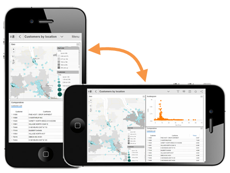 |
More types of widgets
The Salient mobile app can show more types of widgets that enhance the dashboard design.
|
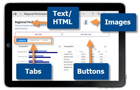 |
Buttons, text/HTML and image widgets can be turned on/off for mobile in edit mode of the Salient Dashboards browser application.
Dashboard panning
|
You can easily navigate in dashboards that are longer than the screen. When "dashboard panning" is on, swipe anywhere on the screen to pan the dashboard up or down. If you want to scroll data within a widget (e.g. grid with many rows), just turn off dashboard panning by clicking the icon at the top of the screen. |
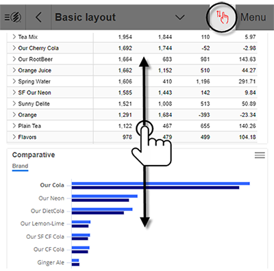 |
Version 1.9.22
Enhanced visualizations
This version supports new ways to represent data in Salient Dashboards V7.70+, including:
|
"Unstacked" two-way graph This new format of the Crosstab graph provides a simple visual representation of data grouped two ways at once, so that you can directly compare cross-sections of of data (e.g., brands in each region). |
|
|
Heatmaps In grids, heatmap highlighting makes it easy to spot high values across large amounts of data. |
|
|
Consistent attribute coloring Dashboard Designers can choose standard colors to represent members across a dashboard. |
|
|
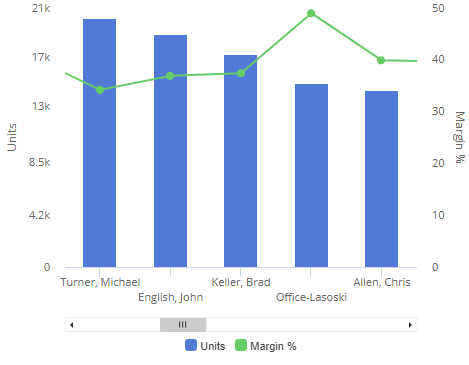
Comparative line graphs The comparative graph can show data as lines, in addition bars and markers, to distinguish different types of data and/or represent numeric dimensions. |
|
Improvements in row expansion
-
Dashboards remember expanded rows of data, so you can see built-in levels of data immediately upon opening a dashboard.
-
The top number of rows, as determined by the Dashboard Designer, can automatically expand to show details for those items.
Always show totals/averages
Your administrator can optionally turn on a setting to always show total and average rows in applicable widgets, even if that information is hidden in browser-based dashboards.
Version 1.9.15
Notifications
The Notify capability in Salient Dashboards V7.60+ sends automated notifications based on dashboard data and custom business rules. For example, get notifications for low volumes, margin thresholds, out-of-stocks, pricing issues, increasing costs, and much more, according to your organization's preferred schedule (daily, weekly, etc.). Notifications may be sent whenever data meets test criteria or when the status of something changes.
|
Salient notifications appear on your device just like other notifications. (Notifications must be allowed.) Simply tap to open the underlying data in the Salient mobile app. As always, the mobile view is interactive and drillable, offering opportunities for further investigation. Notifications may also be sent as email messages. |
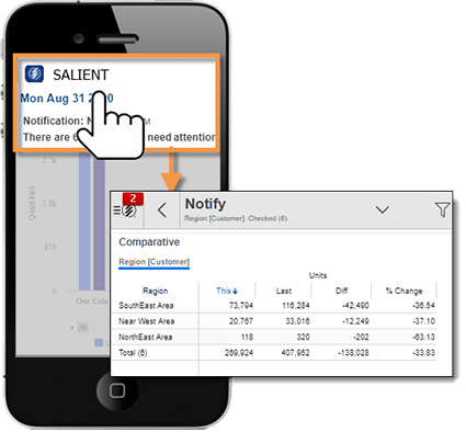 |
To set up notifications, go to the Notify area of Salient browser-based dashboards (V7.60+). See the help for more information. Additional installation and configuration are required for Notify.
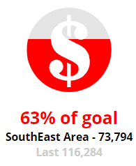
Custom views
Custom views provide endless ways to visualize dashboard data. Dashboard Designers can build custom views using HTML, JavaScript, and a simple, built-in scripting language, to make them available in Salient browser-based dashboards and the mobile app. (Salient Dashboards Version 7.60 or higher is required.) Built-in templates include simple text recommendations, bullet charts, image overlays, and more. For example:
|
Goal percentage
|
Tile view
|
Volume comparative
Mutli trend
Version 1.9.14
Single sign-on (SSO)
This version supports single sign-on (SSO) authentication using the new Salient Authentication service and an external Identity Provider (IdP). Additional installation and configuration are required. Contact Salient for more information.
Support for new dashboard design options
Salient Mobile supports design enhancements in Salient Dashboards Version 7.50:
-
Dashboards can use new color palettes, including built-in palettes that come with Version 7.50 and custom palettes configured by your organization. Like other design options, color palettes are selected during dashboard creation.
-
Highlighting is available for totals, averages, and subtotals, to make it easier to identify summary metrics that fall within or outside of expected ranges. (Highlight settings must be built into the dashboard during creation.)
Version 1.9.12
Explore the data
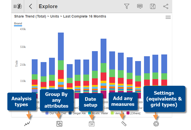
Perform advanced data investigation in a new "explore" mode within the mobile app. Pick any widget or a built-in starting point and then see where the data leads. Tools at the bottom of the screen allow you to interrogate the data: change the analysis type; group the data by more attributes (any available in the dataset); add any measures; change the date range; customize grids; and more.
After exploring, you can optionally save changes in a new dashboard.
Explore mode may be disabled by your administrator.
Mix, % change, and other computations
Add performance calculations, including mix (percent of the total), % change, difference, and average per period, in grids of numbers.
Expand a calculated measure
This version allows you to expand a calculated measure to see its components.
Set your own downlevel order
|
Choose the order of attributes used when expanding members or drilling down. Just drag and drop in the menu. |
 |
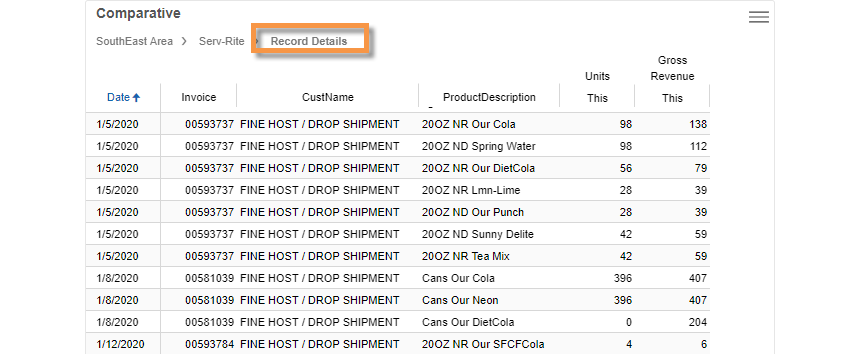
Record details
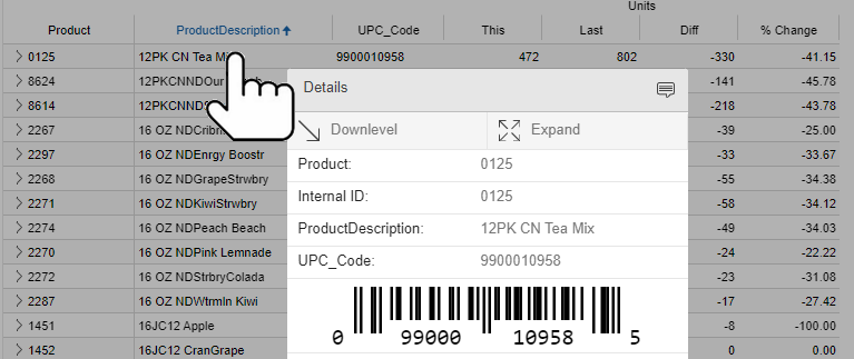
Salient Mobile can show record-level data (e.g. invoices, work records, inventory, etc.). Record details may include dates (single date for transactions or start/end dates for non-transactional data), measures, key descriptions, dimensions, and invoice numbers (if configured).
This capability is available as a new grouping method. Both grid and graph formats are available. The details may be filtered to show any subset of data records for any timeframe.
Version 1.9.11
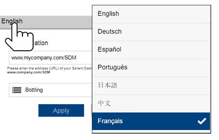
The Salient Mobile app is available in French. You can choose a language in the login setup screen. (The dataset language is configured separately.)
Version 1.9.9
This version adds support for accessing Salient Dashboards via a Microsoft Azure Application Proxy.
Version 1.9.8
Clear filters faster
It is now easier to remove filters when you want to show more data.
Clear all location filters
|
Tap the trash icon in the corner of the home screen to turn off all location filters at once. |
Clear individual filters
|
In the Filters panel, tap the X to clear a dimension or key filter (i.e., show data for all members). Tap the trash icon to completely remove a filter. Key and dimension filters must be cleared before you can remove them. |
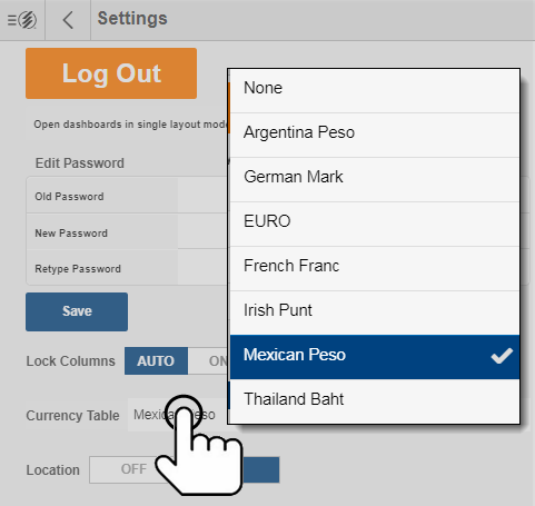
Currency selection
You can change the currency from within the mobile app. Go to the Settings area and pick your preferred currency. (The dataset configuration must include currency tables.)
Version 1.9.7
This version supports new features in Salient Dashboards that give Designers more control over dashboard appearance and functionality. These features require Salient Dashboards Version 7.10 SP1 or higher.
-
Grid/graph toggling may be restricted by the Designer to provide users with simpler, pre-configured displays.
-
Graphs can use custom highlighting colors (if configured).
-
In trend, comparative, and multi comparative widgets, custom graph labels allow Designers to apply meaningful terminology and simplify graphs.
Version 1.9.5
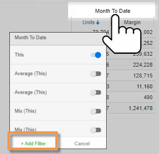
Quick-pick date options
|
Choose from the same easy date options that are available in browser-based dashboards. For example, see the month-to-date, last month, last six months, or year-to-date compared to a previous timeframe. Select a resolution, and then tap and choose on whatever timeframe interests you. |
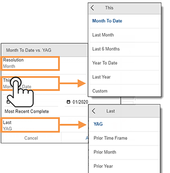 |
Version 1.9
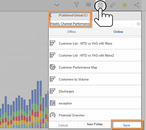
Save your own customized dashboards
This version lets you save your own dashboards within the mobile app. Customize dashboards by filtering, selecting measures, and more, and them save them to create a set of dashboards for your own unique purposes. Depending on account settings, you may be able to save private and/or global (i.e., shared) dashboards.
Manage dashboards
The mobile app now provides dashboard management features so you can organize your dashboards while you are on the go.
Delete and rename dashboards
|
TAP AND HOLD to delete or rename a dashboard or dashboard folder. |
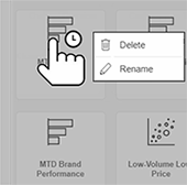 |
Create dashboard folders |
|
|
You can create your own folders for organizing dashboards. This option is available when saving a dashboard.
|
 |
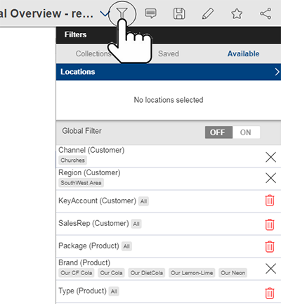
Advanced filtering
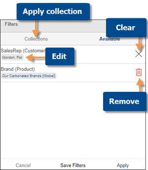
Custom collections
|
You can create and apply custom collections of members to narrow down on your preferred areas of the business. Collections can be saved for future use and/or utilized for ad-hoc filter selection. Collections can be used in other dashboards and by other users (if global). Go to the Collections area in the Filters panel to choose an existing collection or create your own. |
 |
More types of filters
|
The filters panel includes more types of filters in this version. If global filters are off, this includes all workspace filters built into the dashboard as well as collection-based filters. If global filters are on, this includes all applicable global filters, which are expanded in this version to include any global filter used as a Group By or workspace filter in the dashboard. |
 |
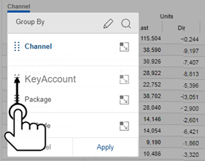
Custom ways of grouping the data
Dashboard Designers can create custom ways of grouping the data, called "custom groups." In the mobile app, you can pick a custom group just like a regular "Group By" to roll up and compare custom collections by performance, history, business initiatives, or any other way.
Improved graphs
Pie chart insights
|
Labels show who or what each slice represents, allowing for a simpler graph without a legend. The labels type must be pre-configured into the dashboard. |
 |
Improved two-way graphs
|
The new horizontal format of the Crosstab graph shows more data on the screen. |
 |
Map enhancements
Transparency is available in Geo maps to make them easier to read. In addition, custom buckets of data can now be used to match up ranges of data to specific colors (e.g., green for positive change and red for negative change). These settings must be pre-configured in the dashboard.
Version 1.8
Global filtering
You can turn on global filters to re-use them across multiple dashboards. This enhancement makes it easy to stay focused on any area of the business while viewing the data in a variety of dashboards and widgets.
|
To select global filters, open a dashboard, make sure that global filtering is on, and choose what you want to see. Global filters can utilize saved filter sets or you can make your own selection when you turn the filter on. You can then apply the global filters to any other dashboard by simply opening the dashboard. Note that only applicable filters will be applied. |
 |
|
The home screen shows a snapshot of the global filters that are currently on and lets you remove them. |
 |
You will receive a prompt to apply global filters when you open a dashboard with global filters on for the first time. After that, global filters will be automatically applied each time you open a dashboard. You can control this behavior (i.e., automatically apply global filters or show prompt) in user settings.
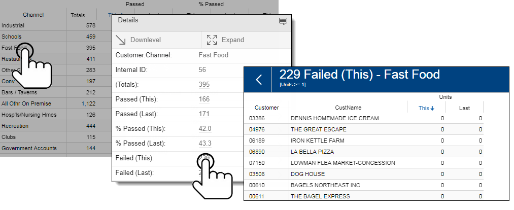
Pass/fail details
In an Exception grid or graph, just tap to see details and tap again to see underlying lists of passing, failing, or total members (e.g. customers who did or did not buy).
Version 1.7
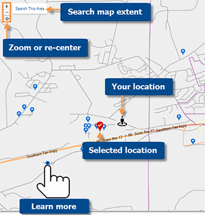
Location maps
This version allows you to map nearby locations that are defined within the dataset (for example, nearby customers or assets). In previous versions, the nearby locations were shown in a list format. Now an interactive map is also available.
|
You can pan and zoom in the map to see details or look at a different area. Just click to re-run the search within any map extent (for example, find nearby locations for an area that you plan to visit in the future). The map lets you easily find out more about any location. Tap on a location in the map to see details or mark a location in the list to make it easy to spot in the map. Additional setup is required. |
 |
Version 1.6
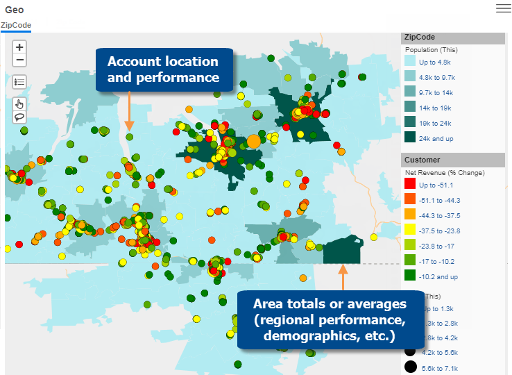
Geo
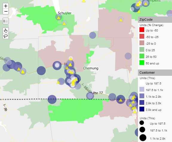
A Geo widget is now available to provide geospatial intelligence in dashboards. Maps can include markers that show precise account locations and performance (e.g., size and color may represent data values, change, etc.). In addition, the map can shade areas based on data totals or averages to reveal performance trends and areas of interest. The map is interactive: pan, zoom, select markers, list them out, filter, etc., as you follow the data wherever it leads. The Geo widget requires additional server installation and setup.
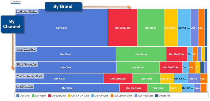
See it two ways at once
New formats of the Crosstab widget are available to visually represent change or intensity broken down two ways at once. The graph can be customized to show data values, change since another timeframe, and/or attributes, to provide endless possibilities for visual data analysis. Here are just a few examples:
Two-way share graphs
The Mondrian makes it easy to spot which items are most significant across another attribute (e.g., significant brands across regions).
Visualizations for gains and losses
The DeltaMap can reveal significant changes since another timeframe
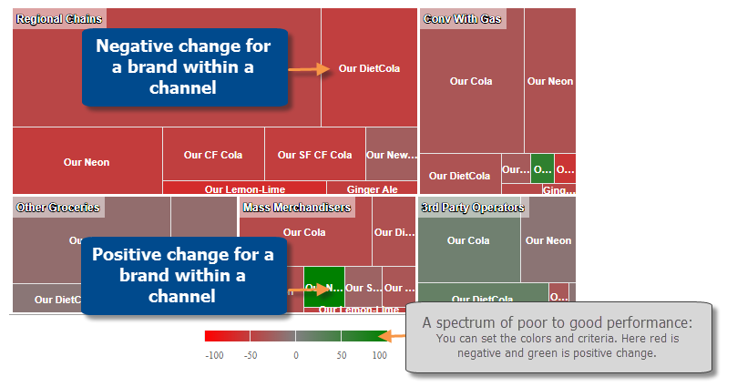
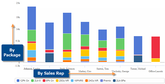
Totals and details in one view
The Stacked Bar graph compares totals across an attribute (e.g., sales reps) and, at the same time, breaks the data down further by another attribute.
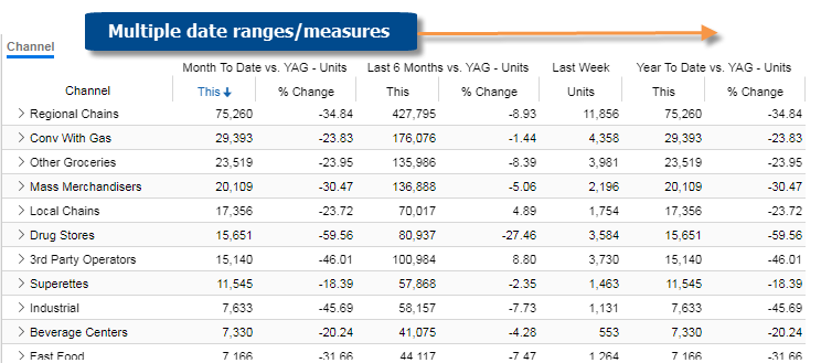
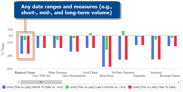
Multiple customized timeframes
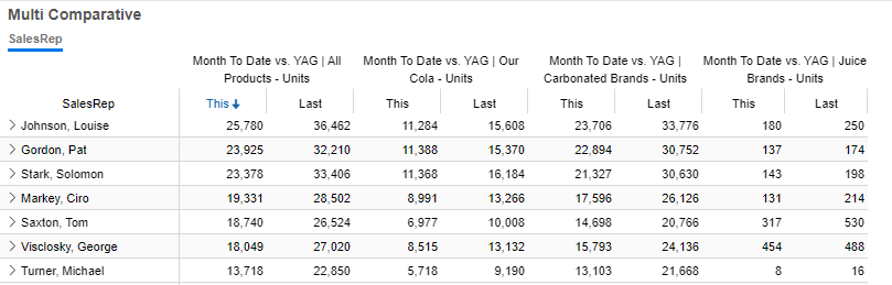
The Multi Comparative widget can include any combination of custom date ranges for any measures. For example, compare weeks, months, and year-to-date to earlier date ranges.
Multi Comparative grids
Multi Comparative graphs
Improved filtering
More control over filters
This version of dashboards introduces new types of interactive filters to help users narrow down on the exact piece of information needed. You can edit or remove most types of filters using the breadcrumb path at the top of the widget and/or the filter panel.
Linked filters
In this version, the filter panel automatically limits selections based on other filters in the panel. This makes it easier to choose data that is available and relevant.
Date range enhancements
Easier date selection
When changing the dates, you can select the “resolution,” which is the type of timeframe (e.g., day, week, month, etc.). This enhancement allows for easier date selection because you don’t need to pick start and end dates down to the specific day for most resolution types.
Relative/moving timeframes
You can pick a date range that updates over time (e.g., most recent month, most recent two months, last week, etc.) in widgets that are set up to use relative date ranges.
More efficient dashboard loading
Widgets are now loaded on an “as needed” basis (i.e., only what’s on the screen). This results in faster loading of dashboards that have multiple widgets available via swipe.
Security & usability
You will receive a prompt when it’s time to change your password.